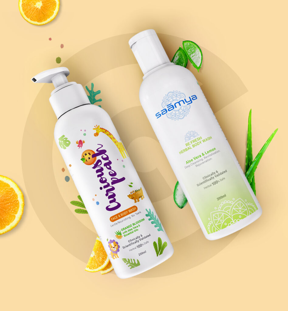
AHA

Uncategorized

Smiling woman with orange towel applying skincare product, "simplicity is beautiful" and "vitamin therapy" text
Uncategorized

Creme 21

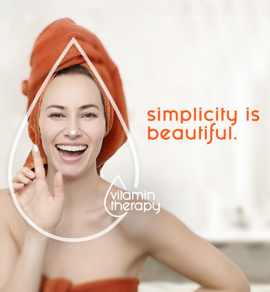
Making orange evergreen. Originally founded by Henkel in the 1970s, Creme 21 was later acquired in 2003 by Antje J Willems Stickel, which was then acquired by Emami in 2019. AHA secured the global mandate for the brand, with an initial focus on making it appealing to Emirati and Arab women in the GCC region. Go Back MAKINGORANGEEVERGREEN Originally founded by Henkel in the 1970s, Creme 21 was later acquired in 2003 by Antje J Willems Stickel, which was then acquired by Emami in 2019. AHA secured the global mandate for the brand, with an initial focus on making it appealing to Emirati and Arab women in the GCC region. In a market where brands like Nivea, Jergens, St.Ives, and Vaseline had long dominated, Creme 21, with its no-frills vitamin-focused formulation, aimed to become the most preferred skincare brand in the market. Our goal was to make Orange the new rage. 2019 While consumers embraced the complexity of regimens in beauty and cosmetics, research uncovered a contrasting preference for a simpler, safer, and natural approach to skincare. This contradiction inspired our organising idea, a powerful concept that not only set the brand apart from competitors but also celebrated its 50-year legacy of German skincare expertise. INJECTING AHAIN THE IDEAS While creams and lotions serve the purpose of nourishment and moisturisation, women associate their benefits with beauty. Women aspire to display the radiance of their skin, considering glowing, healthy, and nourished skin as a testament to beauty. THUS “SIMPLICITY IS BEAUTIFUL” WAS BORN The beauty of Creme 21 lies in the simplicity of its vitamin-enriched formulation. The beauty of a woman lies in the simplicity of her radiant skin. TAKING THE IDEA TO THE CONSUMERS VISUAL LANGUAGE: VISUAL LANGUAGE: Given that the fundamental concept revolved around “simplicity,” we needed the visual language to align with it – a clean, simple, contemporary yet powerful appeal. FILM: FILM: To illustrate the power of the idea, we felt that a musical montage would be an ideal construct. This montage captured various phases of a woman’s life, spotlighting her fulfilment of simple yet significant milestones. These moments, including embracing self-love, coming of age, savouring womanhood, experiencing love, uniting with family, and other personal milestones, are reflected in the radiance of her skin. Creme 21 celebrates and stands as a companion in these moments, reinforcing her sense of beauty. The film’s magic is woven through its music, and at AHA, we hold the belief that where words may falter, music steps in to fill the void, embodying the sentiment that “Music is the shorthand of emotion.” We crafted the lyrics, composed the track, and brought in local artists from their regions to perform it. The song was created in English, Arabic, French, and Urdu, with a strategic focus on reaching audiences in Europe, the Middle East, Africa, and Pakistan. RESULT: RESULT: QUALITATIVE Brand track showed a steep rise in awareness and salience in the first phase of the campaign. QUANTITATIVE By the end of the 180-day campaign, the brand climbed up to the fifth position and attained a market share of 2.2%. 2021 Two years post its introduction in the Middle East, Creme 21 aimed to establish a stronger presence in the region’s largest market – Saudi Arabia. However, the hurdles were substantial. One significant challenge was connecting with the younger generation, who although stepping out of the shadows of the past, still grappled with the constraints of a conservative culture, limiting avenues for expressing their freedom. How could a brand known for its bold and disruptive identity make its presence felt in a country where voices struggled to be heard? The answer rested in positioning Creme 21 beyond a skincare brand— an enabler that nurtures confidence and resilience in women. A confident person who celebrates and cheers those who aim to live life on their own terms. INJECTING AHA IN THE IDEAS As women in Saudi Arabia progressively embrace their individuality and pursue their aspirations amidst the challenges they face, many struggle to find a broader platform for self-expression. Frequently, they experience isolation, with limited societal influencers supporting or catalysing the change they aim to bring about. Through this campaign, we aimed to add voice and velocity to this movement, honouring and celebrating the confidence and passion of women who radiate beauty through their accomplishments. Our goal was to take the lead in redefining beauty, shifting the focus from ‘Looking good’ to ‘Achieving big.’  That’s how ‘I am comfortable in my own skin’ was born. TAKING THE IDEA TO THE CONSUMERS VISUAL LANGUAGE:  VISUAL LANGUAGE: In our campaign visuals, vibrant and diverse women take centre stage, each exuding confidence and purpose. The imagery shifted away from conventional beauty standards, showcasing the strength and resilience that define true beauty. The campaign’s visual language communicates a powerful message: beauty lies in accomplishments, individuality, and the pursuit of one’s dreams. It’s a celebration of women breaking barriers and redefining societal expectations. FILM: FILM: While our initial intent was to produce one big film, our exploration into the culture led us to a fascinating discovery—the number 6. In Arabic culture, the number 6 holds deep symbolic significance, associated with balance, harmony, completeness, and perfection. Inspired by this cultural context, we crafted six films instead of one. Each film vividly portrayed the unique stories of six women and their unconventional journeys. Moving beyond the conventional societal roles of mother, daughter, wife, and sister on the one hand and the vanity of superficial beauty on the other, these women transcend as champions and contenders, embodying the essence of balance, harmony, completeness, and perfection. The recurring line, ‘It makes my skin soft and my determination stronger,’ served as a unifying thread across all six films, forging a powerful and deep connection throughout the series. RESULT: RESULT: QUALITATIVE Creme 21 was awarded the “ET Best Brand 2021” in personal care and is widely recognized as a power to reckon with. QUANTITATIVE Creme 21 climbed 2 spots to number 3 in overall market

Uncategorized

Packaging

Packaging Label Design Labels that not only stand out on the shelf but also communicate the essence of your product at a glance. Structure Design Innovative packaging structures that balance form and function, offering both practicality and visual appeal. Pack Design Eye-catching pack designs that turn products into experiences, capturing consumer attention and loyalty. SRP (Shelf-Ready Packaging) Efficient, visually compelling SRPs that enhance retail presence and streamline operations for retailers. Need Help? Reach out to us

Mandala Innovation Network logo over a cityscape, with colorful lotus flowers, boxes, and confetti illustrations around the border.
Uncategorized

Mandala

Finding meaning in the chaos. In the midst of vibrant urban landscapes, where life paints a lively picture, an often-overlooked reality persists – the stark existence of slums. Defined by the United Nations Human Settlements Programme, slum households lack access to improved water, sanitation, security of tenure, and sufficient living areas. To address the profound challenges faced by underserved communities, exemplified by Salia Sahi, our organisation embarked on a transformative mission. Recognising the inherent potential within slums, we aimed to bring together the collective power of people, resources, and innovation. Go Back FINDINGMEANINGIN THECHAOS In the midst of vibrant urban landscapes, where life paints a lively picture, an often-overlooked reality persists – the stark existence of slums. Defined by the United Nations Human Settlements Programme, slum households lack access to improved water, sanitation, security of tenure, and sufficient living areas. To address the profound challenges faced by underserved communities, exemplified by Salia Sahi, our organisation embarked on a transformative mission. Recognising the inherent potential within slums, we aimed to bring together the collective power of people, resources, and innovation. At the core of our mission was the commitment to create self-sustaining slums, introducing order into apparent chaos. Understanding the challenges faced by slum dwellers and the power divide, our focus extended to empowering these communities. We aimed to bridge the gap, acknowledging that slum dwellers needed external support for transformation. The lack of necessary human and financial resources posed significant barriers to a clean break from their enduring challenges. AHA was brought in to shape the construct and architecture of the project, crafting the project’s identity and designing and developing a portal for seamless information dissemination and collaboration. INJECTING AHA IN THE IDEAS Slums exist in a legal gray area, often unrecognised, arising from encroachments. This complex reality is deeply intertwined with ‘humanity.’ Despite external efforts by governments and NGOs to enhance living conditions, the fundamental issue persists, and the system relies heavily on external aid, creating a perpetual state of uncertainty. While acknowledging that fundamental needs like water, sanitation, and education pose challenges in slums, the solution must organically emerge from within. Slums serve as hubs for various skill sets, such as carpentry, plumbing, and electrical work. Rethinking urbanisation requires embracing a new vision where slums are integral components of cities, evolving into Smart Slums. Often perceived as chaotic, these slums possess untapped potential to act as catalysts for inclusive growth. While there is inherent chaos in the system, we wanted to engineer reverse chaos. Reverse chaos, symbolising order emerging from chaos, hinges on an organisation’s balance between stability and change. Understanding this balance is key for sustainability, enabling an organisation to thrive amid complexity. The transformative journey from Smart Slums to Smarter Cities signifies a holistic approach to urbanisation, where every segment, regardless of its initial perception, plays a crucial role in shaping the cities of the future. This led us to our AHA moment – harness the intrinsic strength and skill set within the slum, rather than relying on external assistance. By harnessing the collective power of these skills, we can transform a slum into a ‘smart slum’. TAKING THE IDEA TO THE CONSUMERS Identity: The concept of self-similarity and self-sufficiency finds expression in fractals, where overlaps bring complexity but also form an intelligent pattern that ultimately resolves the chaos. This notion mirrors cultural elements, such as the Mandala which in Hindu mythology, represents prosperity in every house. The symbol is drawn in front of main doors and courtyards to welcome positivity and good vibes. In our quest for a meaningful essence, we chose the lotus petal as our symbol, representing purity and beauty thriving unexpectedly. Applying sacred geometry, the lotus petal transformed into a mandala—a circular design. The interwoven lotus petal fractals at the logo’s core symbolise chaos, while the overall shape radiates symmetry and geometric precision, portraying a sense of order emerging from chaos. Website: In response to the growing challenges posed by the exponential increase in slum populations since the 2011 Census, a visionary approach emerged – the need for ‘Smart Slums’ within the concept of ‘Smart Cities.’ Urbanist Sanjeev Sanyal, in 2014, advocated for integrating ‘Smart Slums’ into the urban landscape, envisioning a design that fosters social and financial mobility for the underprivileged. The website development embraced this vision, utilising a robust and user-friendly platform to ensure accessibility. The design incorporated seamless storytelling, leveraging creative elements to effectively convey the narrative of empowering slum communities. The website became a digital gateway, advocating for and supporting the integration of ‘Smart Slums’ as an integral component of urban development. Explore more xndm creme 21 FUTUREFLY Want to make your brand smarter? Get in touch

Cold Howling Wolf pomegranate non-alcoholic malt beverage can with water droplets and mist in a dramatic setting.
Uncategorized

Howling Wolf

Creating a buzz-worthy brand. A leading global spirits and alcohol brand sought to venture into the non-alcoholic beverage market, targeting a youthful demographic who desired a good time without alcohol. The challenge was to create a brand that resonated with this audience, providing a sense of belonging and becoming a choice they would proudly carry and flaunt. Go Back CREATINGA BUZZ-WORTHYBRAND A leading global spirits and alcohol brand sought to venture into the non-alcoholic beverage market, targeting a youthful demographic who desired a good time without alcohol. The challenge was to create a brand that resonated with this audience, providing a sense of belonging and becoming a choice they would proudly carry and flaunt. The objective was to establish relevance by offering a non-alcoholic option that aligned with the lifestyle and preferences of individuals seeking enjoyable moments without alcohol. AHA was entrusted with the task of designing a brand identity and conceptualising the packaging for the product. INJECTING AHA IN THE IDEAS Discovery 1: When exploring the alcoholic beverage category, we observed that contemporary consumers were drawn to fun and unique names, not traditional ones associated with lineage and craftsmanship. The emerging trend suggested a desire for names that felt personal and could break away from historical connotations, as exemplified by brands like Bira and White Owl. Discovery 2: Non-alcoholic options were often associated with mocktails, and our target audience, the youth, didn’t resonate with the idea of holding a conventional vanilla drink. Recognising this, we aimed to craft an identity projected through packaging that exuded the tonality of a powerful and social beverage, breaking the stereotype. These insights led us to conceptualise an identity that could generate excitement – a buzz, quite literally. We brought to life the ‘Howling Wolf’ a distinctive choice that carried powerful imagery. Drawing inspiration from the social dynamics of wolf packs, known for their herd mentality, the name embodied the idea of a non-alcoholic drink that brought together a tribe/pack of like-minded people who could have a good time over a non-alcoholic beverage. TAKING THE IDEA TO THE CONSUMERS Identity: The logo, positioned against a white circular backdrop symbolising the moon, incorporated a howling wolf. Much like wolves that howl in packs when the full moon is out, the brand logo established the same message. The design remained faithful to the brand’s name, encapsulating its essence simply. Packaging: We envisioned the beverage elegantly packaged in a can, not only for its simplicity but also to evoke a sense of premium quality. The decision to use a can is akin to the excitement of opening a can of beer or fizz, symbolising the beginning of a fun night sans the alcohol. Explore more emami gold q studio TAAP Want to create a buzz? Get in touch

Two white body wash bottles with orange slices, lime wedges, and green leaves on warm yellow background
Uncategorized

Hapikey

The Key to happiness. The brand’s origin traces back to the moment when a mother and grandmother were looking for personal care products for their newborn grandchild. Upset by the lack of trustworthy options—many claiming safety and herbal attributes without concrete assurance—they recognised a gap in the market. This concern extended beyond baby products, revealing a broader issue with adult personal care items following the same pattern of greenwashing and vanity certifications. Go Back THE KEYTO HAPPINESS The brand’s origin traces back to the moment when a mother and grandmother were looking for personal care products for their newborn grandchild. Upset by the lack of trustworthy options—many claiming safety and herbal attributes without concrete assurance—they recognised a gap in the market. This concern extended beyond baby products, revealing a broader issue with adult personal care items following the same pattern of greenwashing and vanity certifications. As Indians, when our strength lies in herbal wisdom, and there is so much knowledge around it, why were we not using that to offer products that are good for people and the world? This realisation led to the creation of a brand that only offered truly herbal products that were also clinically tested. AHA was tasked with transforming the concept into reality- identifying market opportunity and feasibility, developing the brand, identifying manufacturing partners, product formulation strategy and GTM. INJECTING AHA IN THE IDEAS In the pursuit of crafting a genuinely herbal product accessible to all, our team embarked on an extensive journey, delving into various aspects to ensure a holistic solution. Discovery 1: During our research, it became apparent that products designed for children lacked a focus on health, safety, and suitability for their specific skin types. Discovery 2: A staggering 90% of the existing products in the market were found to deviate from the herbal aspect we aimed to incorporate into our brand. A staggering 90% of the existing products in the market were found to deviate from the herbal aspect we aimed to incorporate into our brand. Discovery 3: The prevalent approach seemed to be a generic “one-size-fits-all” strategy, with little to no consideration for the diverse needs associated with different skin types. Discovery 4: An alarming observation was the lack of clinically proven benefits in the majority of products, relying on mere statements and falling prey to greenwashing practices rather than substantiating their claims through rigorous scientific validation. The idea of the brand was not to emulate others but to disrupt the market, an intention that the brand aimed to fulfil, ultimately resulting in consumer satisfaction. This choice was not merely about creating a series of products; it was about providing a solution that went beyond fostering happiness. This led us to the idea of the name of the company – Hapikey, which symbolised a solution that encompassed more than products; it ensured contentment, rooted in the confidence of maintaining healthy skin and the pleasure of using non-harmful products. The focus was on deriving joy and wellness, making it a pivotal factor for happiness and overall well-being. Aha kickstarted the process by playing a pivotal role in the formulation of the products, aligning them with current market needs and determining effective product types. In this initial phase, our focus was on determining the purest manufacturing methods, helping in determining the ideal formulations and establishing a testing protocol for efficacy. Parallely, we identified and collaborated with manufacturing partners, designed packaging, and facilitated the establishment of an online presence on e-commerce platforms. TAKING THE IDEA TO THE CONSUMERS Identity: The Hapikey logo was meticulously crafted to capture the essence of our brand. The strategic use of the letters A and P forms a friendly face, symbolizing warmth and care. Below, a cheerful smile reinforces the positive and joyful nature of our brand. The letter ‘ E ‘ in Hapikey is ingeniously crafted as a key, signifying access to goodness and wellness. The soft font with rounded edges adds a gentle touch, aligning with our commitment to effective and soothing products. The overall design encapsulates Hapikey’s core values – unlocking well-being with a friendly, positive, and accessible approach. The emphasis was not only on imparting information but also on captivating attention. By encouraging pauses and breaks, we cultivated a guilt-free zone, highlighting the significance of prioritising oneself. The core idea was to communicate a message that was not just educational and inspiring but also inherently interesting. This approach centres around effective communication, with supporting elements like colour and tone serving to enhance and reinforce the overarching concept.The Hapikey logo was meticulously crafted to capture the essence of our brand. The strategic use of the letters A and P forms a friendly face, symbolizing warmth and care. Below, a cheerful smile reinforces the positive and joyful nature of our brand. The letter ‘ E ‘ in Hapikey is ingeniously crafted as a key, signifying access to goodness and wellness. The soft font with rounded edges adds a gentle touch, aligning with our commitment to effective and soothing products. The overall design encapsulates Hapikey’s core values – unlocking well-being with a friendly, positive, and accessible approach. The emphasis was not only on imparting information but also on captivating attention. By encouraging pauses and breaks, we cultivated a guilt-free zone, highlighting the significance of prioritising oneself. The core idea was to communicate a message that was not just educational and inspiring but also inherently interesting. This approach centres around effective communication, with supporting elements like colour and tone serving to enhance and reinforce the overarching concept. The Hapikey family: Curious Peach for Kids was all about creating joy, infusing bath time with a sense of fun, and invoking a dreamy and curious spirit within them. The choice of “Peach” was deliberate, aiming to capture the cuteness that retains their innocence. Saamya for Adults derived its name from Sanskrit, signifying equilibrium or balance. It successfully struck a perfect balance between harnessing the power of nature and incorporating the efficacy of modern science. Hapi Shield, the wellness range,

Elegant SAVIA business card with a gold abstract logo on a dark background, featuring modern geometric tile pattern.
Uncategorized

Savia

Taking middle eastern fragrance to the world. In the backdrop of an already saturated fragrance market in the UAE, characterised by the commanding presence of established industry leaders, the primary challenge faced by the brand was the necessity to distinguish itself amidst this crowded landscape. The market, being tightly packed with major players, posed a formidable obstacle to achieving visibility and recognition. Go Back TAKINGMIDDLE EASTERNFRAGRANCETO THE WORLD In the backdrop of an already saturated fragrance market in the UAE, characterised by the commanding presence of established industry leaders, the primary challenge faced by the brand was the necessity to distinguish itself amidst this crowded landscape. The market, being tightly packed with major players, posed a formidable obstacle to achieving visibility and recognition. The challenge extended beyond merely offering appealing scents; it entailed crafting an unparalleled olfactory experience that not only reflected the opulence and cultural richness but also exuded a sense of innovation. The formidable task was to transcend conventional expectations and redefine the narrative around fragrances, transforming them from mere products to immersive experiences. Moreover, the market dynamics demanded a strategic approach that not only captured attention but also communicated the exclusivity and superior quality of the fragrances. The challenge was heightened by the diverse demographic of consumers in the UAE, each with unique preferences and cultural sensitivities. INJECTING AHA IN THE IDEAS To overcome the challenge of establishing a distinctive presence in a saturated market, our strategic solution revolved around the core concept of distinctiveness. Recognising that standing out was not just a desire but a necessity in a crowded landscape, we directed our efforts toward infusing the brand with a truly unique identity, setting it apart from the competition. Our emphasis on distinctiveness was not merely a surface-level makeover; it served as the guiding force shaping the brand’s entire trajectory. This approach not only addressed the immediate challenge of visibility but also laid a foundation for sustained differentiation and success. TAKING THE IDEA TO THE CONSUMERS Identity: ESSENCE At the core of Savia’s DNA lies a deep-rooted essence that heightens the senses and evokes powerful emotions. We at Savia combine creativity with the alchemy of human desire to craft fragrances. Our fragrances are not just scents; they extend far beyond stirring a myriad of feelings within us and others touched by its trail. We partner with brands that share our values of quality, creativity, innovation, and sustainability and offer products for every mood and moment. ESSENCE  At the core of Savia’s DNA lies a deep-rooted essence that heightens the senses and evokes powerful emotions. We at Savia combine creativity with the alchemy of human desire to craft fragrances. Our fragrances are not just scents; they extend far beyond stirring a myriad of feelings within us and others touched by its trail. We partner with brands that share our values of Quality, Creativity, Innovation, and Sustainability and offer products for every mood and moment. A strategic process of deconstructing existing logos and injecting them with meaningful elements was involved. One that resonated with the brand narrative. To reinforce this newfound identity, we developed comprehensive brand guidelines. These guidelines became the cornerstone of the messaging strategy, ensuring a consistent visual language across various platforms. From colour selections to font choices, every detail was meticulously crafted to reinforce the brand’s unique personality. Recognising the importance of physical touchpoints, we extended the brand identity into tangible forms through engaging branded merchandise. This not only strengthened the visual presence but also provided a tangible way for our audience to connect with the brand. COMMUNICATION: In designing the digital communication strategy, we embraced a holistic approach to convey the distinctive brand identity and resonate with the target audience. The focus was on creating a seamless and engaging online presence. Leveraging the power of social platforms, we strategically integrated the redefined visual identity into the social media profiles. Consistent visuals, engaging content, and targeted messaging were employed to maintain a cohesive online brand image. MERCHANDISE AND POSMs: We extended the same brand language into POSMs and Merchandise to ensure the brand had consistency, harmony and a strong recall. Explore more emami shfh plateonic mandala Looking for the scent of success? Get in touch

Two gold coins with a stylized "Z" symbol on top of a digital, gear-like circular background.
Uncategorized

XNDM

Making luxury a new-age currency. The ultra-rich don’t worry about money; they worry about privacy and chase unique experiences. Enter GB Island, where High Net Worth Individuals (HNIs) and the crème de la crème sought to relish life away from prying eyes. Here, the pursuit of pleasure intertwines seamlessly with the commitment to upholding their right to privacy, extending even to financial transactions. This team of innovators embarked on a mission to disrupt the luxury and travel industry by crafting a destination that stands apart from the rest—an island that mirrors paradise yet functions with the impenetrability of Fort Knox. Go Back MAKINGLUXURYA NEW-AGECURRENCY The ultra-rich don’t worry about money; they worry about privacy and chase unique experiences. Enter GB Island, where High Net Worth Individuals (HNIs) and the crème de la crème sought to relish life away from prying eyes. Here, the pursuit of pleasure intertwines seamlessly with the commitment to upholding their right to privacy, extending even to financial transactions. This team of innovators embarked on a mission to disrupt the luxury and travel industry by crafting a destination that stands apart from the rest—an island that mirrors paradise yet functions with the impenetrability of Fort Knox. AHA was tasked with transforming this idea into reality. From developing the master plan to creating 3D visualisations, shaping the project’s identity, naming, and designing the cryptocurrency, AHA had to bring this dream to life. INJECTING AHA IN THE IDEAS Since this was for the ultra-rich, we needed an identity as unique as their opulent lifestyles. Our inspiration stemmed from observing the lavish globe-trotting of the wealthy—a seemingly infinite realm of luxury. That led us to the idea – XNDM An exclusive destination with infinite possibilities. TAKING THE IDEA TO THE CONSUMERS Planning and visualisation: The idea included a blend of luxury and necessities that were intended to be part of the island. Grounded in a futuristic concept, the goal was to incorporate both a sense of the future and luxury. With the vision in mind, we imagined underwater pods, a cruise, an exclusive club, and retail spaces. Following this, we visualised these elements in 3D, aiming to attract investors. The design included all things luxurious and fancy. Identity: Building upon this exclusive proposition, the identity had to mirror its exclusivity. We opted for ‘X’ as a symbolic representation, resembling an infinity symbol, to convey premium quality and a world within the world. This was extended to define the identity of the cryptocurrency as well. The intention was to extend this concept to engage with the investor community and potential future customers and clients worldwide, achieved through a simple, classy, modern, and responsive website. Explore more creme 21 FUTUREFLY kid super store Want to make your brand smarter? Get in touch

Plateonic Foods logo engraved on a wooden board, with lettuce, fries, and grilled vegetables beside it on a rustic surface.
Uncategorized

Plateonic

Enriching the food experience.  Plateonic Foods aspired to transcend the boundaries of traditional dining by crafting an exceptional culinary journey for individuals, delivering a fine dining experience right to the comfort of their homes. The goal was to evolve beyond the confines of a mere cloud kitchen and emerge as an entity that not only provided delectable dishes but also curated an immersive experience, redefining the way people perceive and enjoy gourmet dining in their own spaces. Go Back ENRICHINGTHE FOODEXPERIENCE Plateonic Foods aspired to transcend the boundaries of traditional dining by crafting an exceptional culinary journey for individuals, delivering a fine dining experience right to the comfort of their homes. The goal was to evolve beyond the confines of a mere cloud kitchen and emerge as an entity that not only provided delectable dishes but also curated an immersive experience, redefining the way people perceive and enjoy gourmet dining in their own spaces. The challenge was to seamlessly blend the convenience of home delivery with the sophistication and ambience associated with fine dining establishments, offering a holistic and memorable experience to patrons. INJECTING AHA IN THE IDEAS The solution involved infusing Plateonic Foods with a distinctive identity by centering its offerings around nostalgia, memories, and authentic moments. In a market saturated with numerous restaurants and cloud kitchens, the unique proposition was to go beyond the conventional culinary landscape. Plateonic Foods aimed to set itself apart by not merely presenting food but by intertwining each dish with a narrative, creating an experience that resonated with the emotional and nostalgic aspects of the patrons. The challenge lay in curating a menu that served not just the palate but also stirred the heart, making Plateonic Foods a pioneer in delivering not just meals, but a collection of cherished stories and meaningful connections. TAKING THE IDEA TO THE CONSUMERS Identity: Plateonic’s culinary DNA is encapsulated in 4 tenets, each embodying a distinct aspect of our philosophy: emphasising emotional connection, exploration, storytelling, and the transformative power of culinary alchemy. Emotional Connection: Food that can evoke strong feelings of nostalgia, joy, and comfort. These dishes resonate deeply with personal memories and experiences, touching the soul in a way that leaves one feeling uplifted and fulfilled. Exploration: Food isn’t just about familiar flavours; it’s also about the excitement of discovering new tastes and experiences. The brand encourages consumers to explore dishes that surprise and delight, igniting a sense of wonder and joy. Storytelling: At Plateonic, every dish tells a unique story. Whether it’s a recipe passed down through generations, a dish inspired by a distant culture, or a creation born out of culinary experimentation, these dishes can transport one to a journey of discovery and connection. Alchemy: Plateonic practices culinary alchemy. It’s about mastering ingredients, heat, vessels, and spices to create dishes that transcend expectations. From selecting the finest produce to perfecting the balance of flavours, the brand crafts each bite carefully, ensuring a perfect harmony of flavours that lingers on the palate, inviting one to savour every moment. The identity and design of each subbrand were crafted to reflect its unique culinary experience. Gobbledeeyum featured a playful, colourful design with a cartoon chef, emphasising the fun and enjoyment of Asian-inspired cuisine. Two And A Half Bites used a minimalist design to highlight its balance of flavours. Bakeovers By Saira celebrated the love for global flavours by bringing a homemade touch to international classics. Finally, UTBT had a sleek, minimalist design, reflecting a modern, no-frills approach. Communication: In our pursuit of culinary diversity, Plateonic Foods introduced three distinct menus, each with its unique identity and flavour profile. Gobbledeeyum for Asian cuisine, Two and a Half Bites celebrated the vibrant tapestry of Indian street food, and Bakeovers by Saira took on a global culinary journey. To complement these distinct menus, our social media strategy was expansive and dynamic. We leveraged our handles to engage with the audience through timely and relevant content. The approach involved staying in sync with topicals, current events, and trending subjects. This not only ensured our communication remained fresh and topical but also allowed us to connect with the audience on a more personal level. The creative elements in our social media campaigns were carefully crafted to be bright, relatable, and fun. Each post was designed not just to showcase our culinary offerings but to create an experience. We understood the pulse of our audience and tailored our content to cater to their preferences, making it an interactive and enjoyable journey. PACKAGING, MERCHANDISE & POSM:Plateonic’s packaging reflected its philosophy of delivering more than just food—it encapsulated the essence of an emotional and immersive dining experience. Designed to evoke nostalgia and delight, each package told a story, merging practicality with visual appeal. The thoughtful design not only preserved the quality of the food but also reinforced the brand’s identity through striking imagery and meaningful narratives, making unboxing a memorable moment for customers. Plateonic’s branded cutlery extended the brand’s identity beyond the kitchen, offering consumers a tangible connection to its philosophy. Each piece of cutlery was carefully designed to evoke a sense of belonging to the Plateonic experience, blending form and function with style. The thoughtfully branded utensils embodied the brand’s core tenets—Emotional Connection, Culinary Storytelling, and Epicurean Exploration—inviting customers to carry a piece of Plateonic’s culinary journey with them, even in the smallest details of their dining experience. The promotional collaterals were crafted to tell the brand’s story. They were infused with the same creative energy and meticulous attention to detail as the dishes themselves, utilising visually engaging elements that highlight the brand’s core philosophy. These collaterals served as a window into Plateonic’s world, ensuring that the brand’s message of culinary exploration and emotional resonance was consistently communicated across all consumer interactions. MENU: The menu design for Plateonic was a reflection of the brand’s core philosophy, combining aesthetic appeal with functionality. Each page was thoughtfully crafted to guide diners through the culinary journey, with visually engaging elements that complemented the dishes themselves. The

Emami Gold Beliphool Hair Oil bottle with jasmine flowers, coconut, ice cubes, and butterflies in a green natural setting.
Uncategorized

Emami Gold

Making Emami shine in Bangladesh. Emami, with its resident equity in the Bangladesh market, wanted to launch a greenfield brand that would challenge competition across various categories, one of which being hair oil. Aha was assigned the task of designing the packs for the hair oils for the market. We had a dual objective: winning on the shelf and securing a prominent place in the consumer’s mindshare. Go Back MAKING EMAMI SHINE IN BANGLADESH Emami, with its resident equity in the Bangladesh market, wanted to launch a greenfield brand that would challenge competition across various categories, one of which being hair oil. AHA was assigned the task of designing the packs for the hair oils for the market. We had a dual objective: winning on the shelf and securing a prominent place in the consumer’s mindshare. INJECTING AHA IN THE IDEAS During our research, two key discoveries unfolded. Discovery 1: Most brands typically showcased the main ingredient in a single image without much emphasis on shelf impact and mostly relying on legacy. Discovery 2: There was a lack of clear benefit differentiation between different variants, making it challenging for consumers to distinguish the advantages of one variant from another. TAKING THE IDEA TO THE CONSUMERS Packaging: Our aim was to win the first moment of truth and trigger trials. We wanted to ensure that the design nudges the product from consideration to preference. The benefits were kept upfront while a model with the category semiotics model was highlighted. The presentation of fresh ingredients heightened the herbal equity, emphasising safety without harmful chemicals. Bright hues, fresh ingredients, clear messaging and bold typography were used. The label’s architecture facilitated a natural flow of the eye, carefully designed to seamlessly guide from the brand name to the core benefits, all conveyed within a brief span of less than 3 seconds. Explore more q studio TAAP inito   Want to make your brand look sleek? Get in touch

White Futurefly logo with stylized wings over an aerial nighttime view of a large cargo ship and water.
Uncategorized

FUTUREFLY

Turning tomorrow’s opportunities into today’s possibilities. In the realm of commodity trading, especially in the future trades of crude oil, it’s the little things that matter. Despite deviations per barrel being as small as a few cents, when multiplied over millions of barrels, the exposure becomes a significant concern. Go Back TURNINGTOMORROW’SOPPORTUNITIESINTO TODAY’SPOSSIBILITIES In the realm of commodity trading, especially in the future trades of crude oil, it’s the little things that matter. Despite deviations per barrel being as small as a few cents, when multiplied over millions of barrels, the exposure becomes a significant concern. Existing tools, though allowing traders to take action, faced limitations, mainly confined to outright front-month futures due to platform inadequacies. The absence of solutions for visualising future spreads and intricate doublefly structures prompted the need for innovation. The client aimed to revolutionise the market with a research and analysis tool, enabling the backtesting and forward testing of simulated doublefly structures. AHA was tasked with building the imagery of the product, starting with christening it with a fitting name, crafting the brand identity, designing and developing a demand generation website, and finally generating inquiries through an effective communication strategy. INJECTING AHA IN THE IDEAS This was an extremely niche category. Therefore, an identity that instantly connotes what the platform was about was imperative. Since this is about future commodity trading and doublefly, we brought the two together to arrive at an identity that is intuitive and automatically gets through to the target audience. The inspiration for the distinctive name “Futurefly” was drawn from the platform’s exceptional capability to anticipate future market movements. The concept embodied the essence of taking flight, symbolising a forward-looking and innovative approach to trading. The concept of ‘doublefly’ played a pivotal role in shaping the name, reflecting a strategic and dynamic outlook on market trends. The fusion of these ideas contributed to the creation of a name that not only conveys the platform’s predictive abilities but also captures the spirit of advancement and growth inherent in the world of trading. TAKING THE IDEA TO THE CONSUMERS IDENTITY: The identity was designed to be simple, minimalistic, and easily recognisable. It featured a combination of two letters, F, forming wings, with a pointed arrow at the bottom and a drop signifying oil at the top representing the head. The logo was crafted to resemble a butterfly, symbolising predictability, as the transformation from a cocoon to a butterfly follows a predictable journey. This choice of imagery aimed to convey a sense of transformation and reliability in the brand’s identity. This design aimed to achieve a fresh, youthful brand image with a futuristic touch. The choice of a sans-serif typeface added a bold vibe, complementing the overall brand and logo aesthetic. Website: A dedicated landing page was developed specifically for this. This webpage was carefully designed to meet the distinct requirements and preferences of businesses. The design and content were customised to deliver thorough information and effectively connect with potential B2B clients. The goal was to engage commodity trading decision-makers through a straightforward, intuitive design and messaging, that immediately conveyed the intended idea. Communications: The brand’s communication strategy was extended through social media channels, marking a significant step forward. The approach adopted for social media involved creating concise and impactful creatives that delivered messages directly and efficiently. Explore more kid super store hapikey howling wolf Ready to add wings to your brand? Get in touch

Scroll to Top