FutureFly Branding by Creative Agency India
Turning tomorrow’s opportunities into today’s possibilities.
In the realm of commodity trading, especially in the future trades of crude oil, it’s the little things that matter. Despite deviations per barrel being as small as a few cents, when multiplied over millions of barrels, the exposure becomes a significant concern.
TURNING
TOMORROW’S
OPPORTUNITIES
INTO TODAY’S
POSSIBILITIES

In the realm of commodity trading, especially in the future trades of crude oil, it’s the little things that matter. Despite deviations per barrel being as small as a few cents, when multiplied over millions of barrels, the exposure becomes a significant concern.
Existing tools, though allowing traders to take action, faced limitations, mainly confined to outright front-month futures due to platform inadequacies. The absence of solutions for visualising future spreads and intricate doublefly structures prompted the need for innovation.
The client aimed to revolutionise the market with a research and analysis tool, enabling the backtesting and forward testing of simulated doublefly structures.
AHA was tasked with building the imagery of the product, starting with christening it with a fitting name, crafting the brand identity, designing and developing a demand generation website, and finally generating inquiries through an effective communication strategy.
INJECTING AHA IN THE IDEAS
This was an extremely niche category. Therefore, an identity that instantly connotes what the platform was about was imperative. Since this is about future commodity trading and doublefly, we brought the two together to arrive at an identity that is intuitive and automatically gets through to the target audience.
The inspiration for the distinctive name “Futurefly” was drawn from the platform’s exceptional capability to anticipate future market movements. The concept embodied the essence of taking flight, symbolising a forward-looking and innovative approach to trading.
The concept of ‘doublefly’ played a pivotal role in shaping the name, reflecting a strategic and dynamic outlook on market trends. The fusion of these ideas contributed to the creation of a name that not only conveys the platform’s predictive abilities but also captures the spirit of advancement and growth inherent in the world of trading.
TAKING THE IDEA TO THE CONSUMERS
IDENTITY:
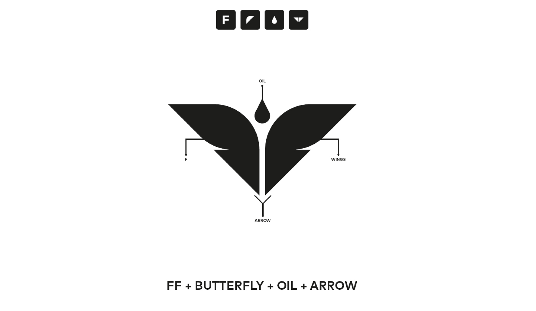
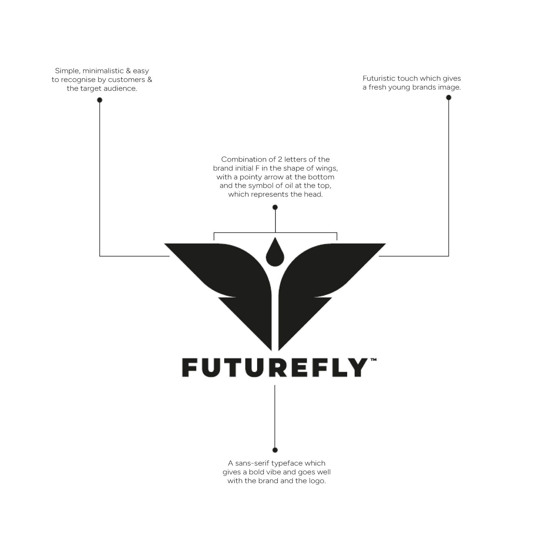
The identity was designed to be simple, minimalistic, and easily recognisable. It featured a combination of two letters, F, forming wings, with a pointed arrow at the bottom and a drop signifying oil at the top representing the head.
The logo was crafted to resemble a butterfly, symbolising predictability, as the transformation from a cocoon to a butterfly follows a predictable journey. This choice of imagery aimed to convey a sense of transformation and reliability in the brand’s identity.
This design aimed to achieve a fresh, youthful brand image with a futuristic touch. The choice of a sans-serif typeface added a bold vibe, complementing the overall brand and logo aesthetic.

Website:
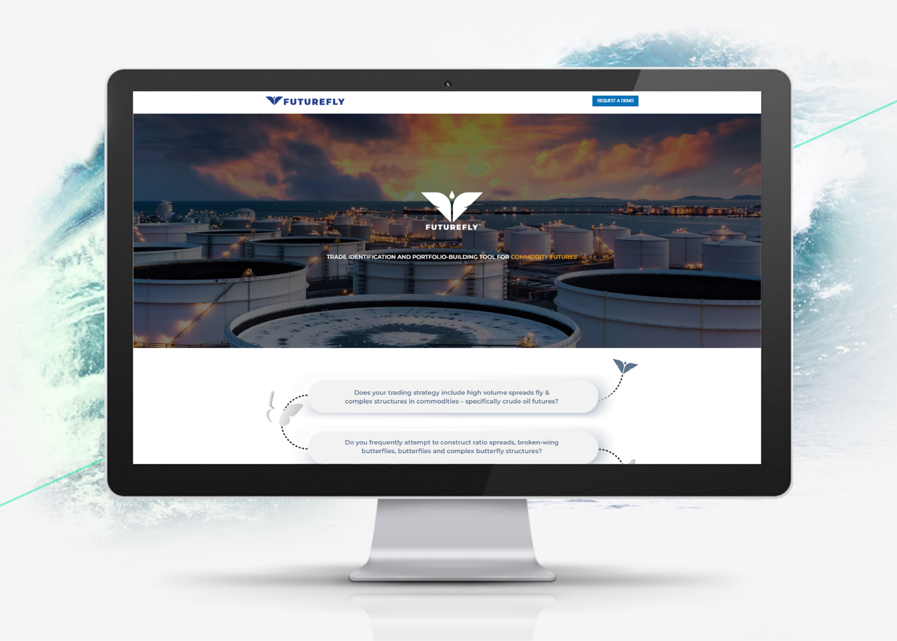
A dedicated landing page was developed specifically for this. This webpage was carefully designed to meet the distinct requirements and preferences of businesses. The design and content were customised to deliver thorough information and effectively connect with potential B2B clients. The goal was to engage commodity trading decision-makers through a straightforward, intuitive design and messaging, that immediately conveyed the intended idea.
Communications:
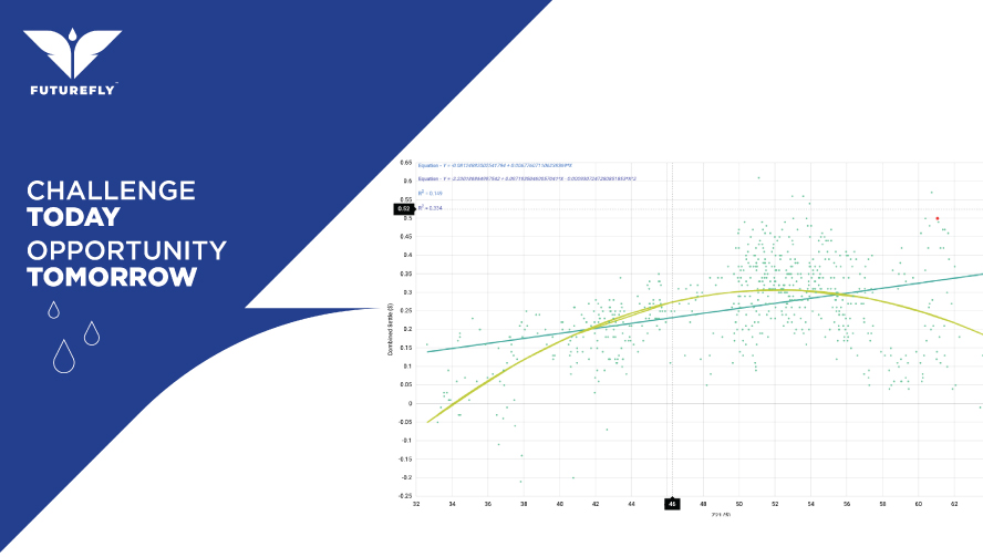
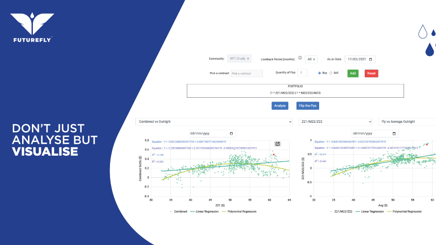
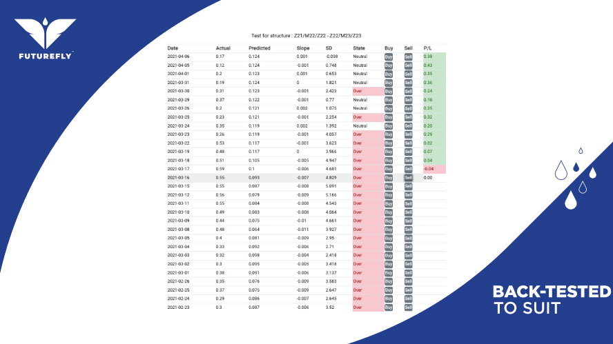
The brand’s communication strategy was extended through social media channels, marking a significant step forward. The approach adopted for social media involved creating concise and impactful creatives that delivered messages directly and efficiently.
Explore more
Ready to add wings to your brand?
Get in touch
