AHA

Q Studio by AHA Agency | Creative Design Agency Work

Normalising quiet time.

Often unnoticed, mental health is a silent struggle that impacts a significant portion of the human population, particularly within a corporate environment. Stress plays a significant role in contributing to this problem. Failing to address this with utmost priority can lead to lasting and irreversible effects.


Go Back

NORMALISING
QUIET TIME

Teal Q Studio logo with a stylized circular "Q" above the word "studio" in lowercase letters.

Often unnoticed, mental health is a silent struggle that impacts a significant portion of the human population, particularly within a corporate environment. Stress plays a significant role in contributing to this problem. Failing to address this with utmost priority can lead to lasting and irreversible effects.

Corporations sometimes try to address these concerns by launching mental wellness programs that lack a solid framework, which is ineffective in the long run. These initiatives yield minimal results and substantially impact morale, productivity, health, family, and more.

Stress is an enduring reality; there’s no escaping it, and no magic silver bullet can eliminate stress from this equation.

But is this acceptable? How can we continue perpetuating this cycle of apathy?

One-size-fits-all wellness programs cannot address issues unanimously. People are built differently, and their capability to deal with and manoeuvre through day-to-day stress differs.

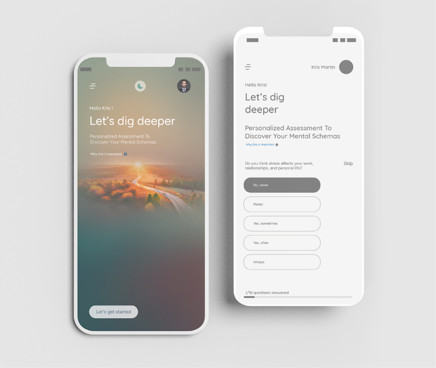
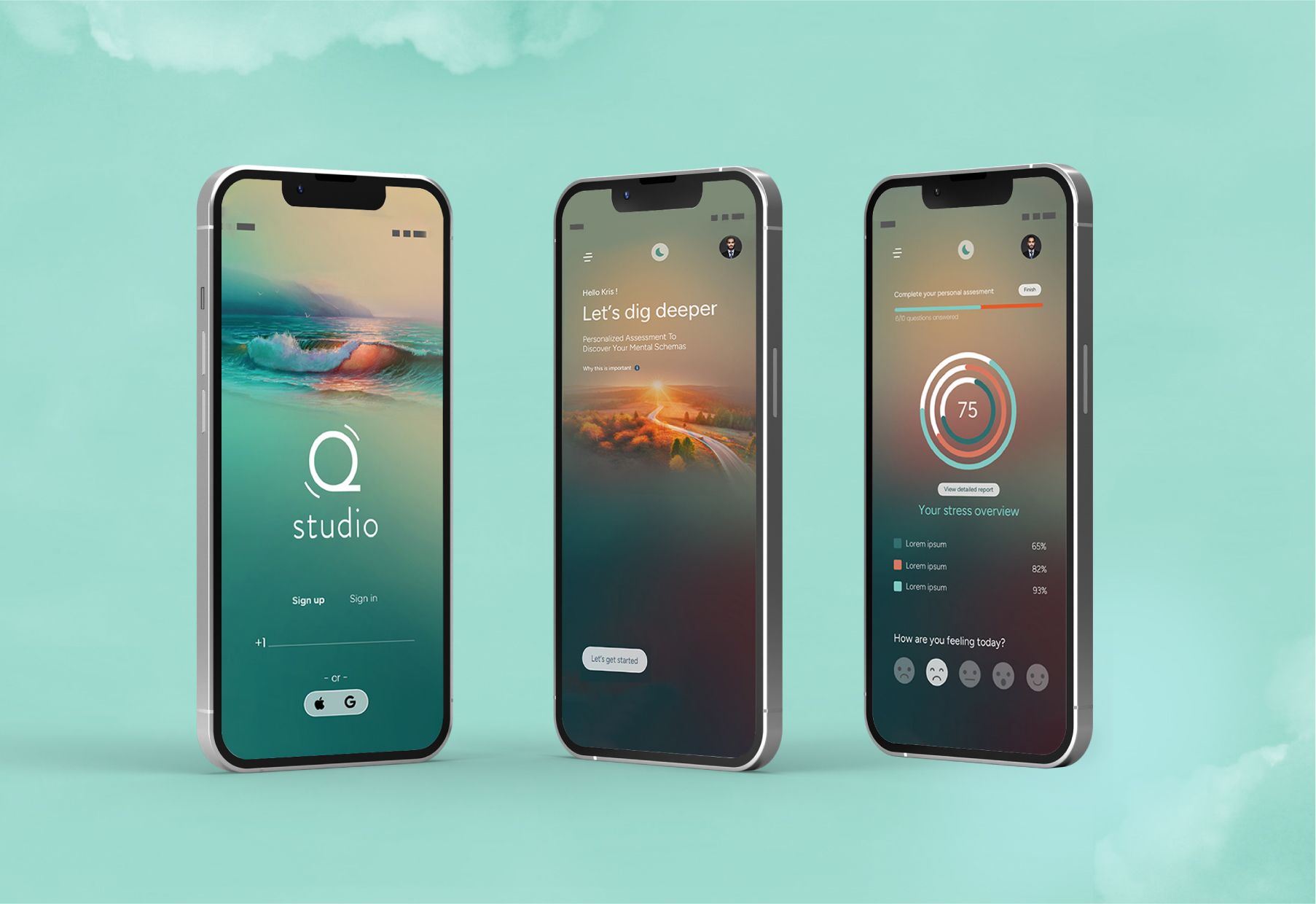
So, when issues are personal, why aren’t solutions personalised?

Individuals’ quiet time preferences vary, and a solution that is bespoke and tailored to the needs of each person is essential.

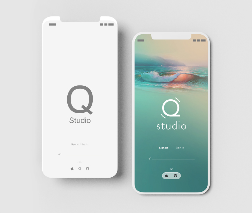
This realisation uncovered a significant gap, and Q Studio aimed to fill that space with a two-pronged approach.

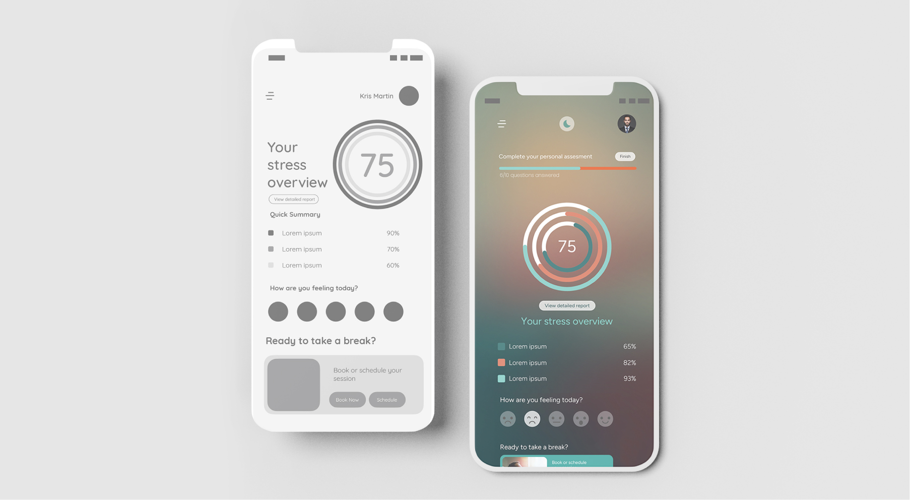
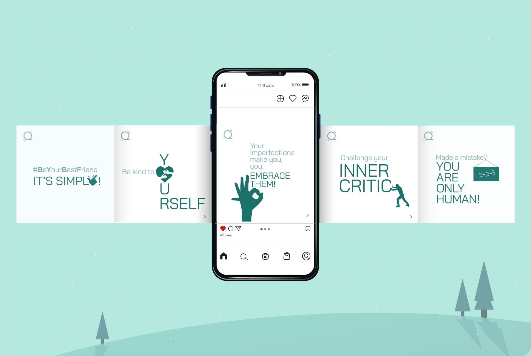
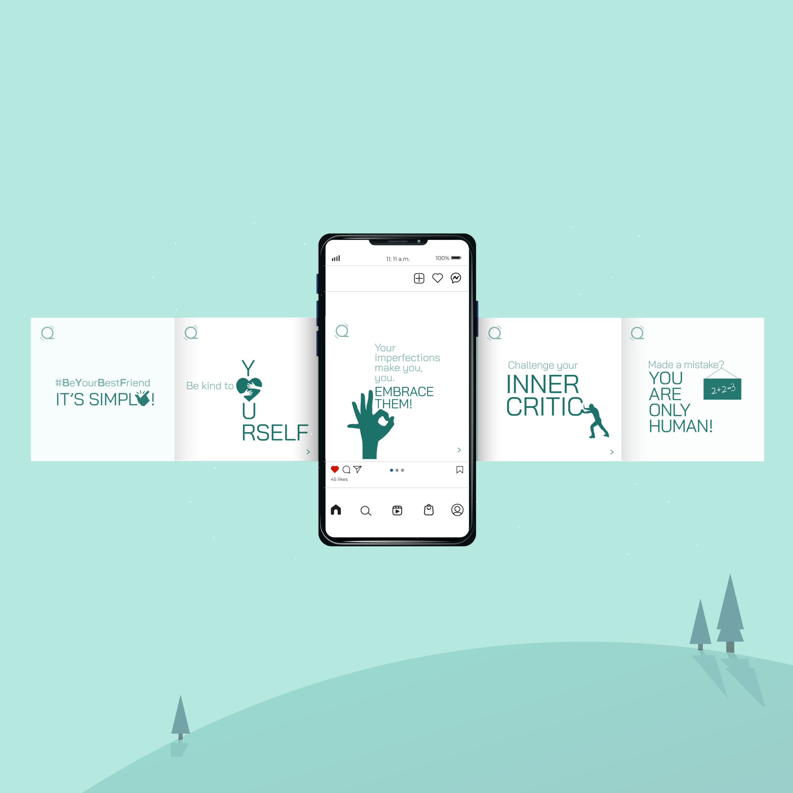
First, to foster a positive culture around mental well-being, helping individuals navigate workplace challenges and helping individuals be more resilient and confident.

Second, to normalise breaks and stimulate more workplace discussions on stress and mental well-being.

INJECTING AHA IN THE IDEAS

While the intent was to bring about change, the question was how.

While the space was already cluttered with multiple apps like meditation, yoga, and personal wellness, there wasn’t a single platform that bridged the gap between the online and offline worlds. Therefore, competing in the market with similar solutions wasn’t going to be effective.

This led us to delve deeper and seek studies and research papers that could validate the idea and the need for it and lead us to the moment of truth.

Discovery 1:

Many people felt guilty about taking breaks. In the fast-paced professional environment, a prevailing culture often values constant productivity and perceives breaks as a hindrance to work. Individuals may fear being judged or viewed as less committed if they prioritise taking breaks for self-care or relaxation. We came across some astounding studies,

A pie chart showing 38% highlighted in teal, with the number "38%" displayed below in bold teal text.

of employees don’t feel encouraged to take a lunch break.

Illustration of five people with one highlighted in teal, representing "1 in 5" in bold teal text below.

employees said guilt is the reason they don’t take any breaks.

A donut chart showing 40% highlighted in teal, with "40%" written in bold teal text below the graphic.

people say they only occasionally, rarely, or never take breaks.

Discovery 2:

While it was widely accepted and even normalised for individuals to take breaks for smoking or caffeine consumption, there was a noticeable stigma or hesitation associated with taking breaks for mental well-being. Employees often felt reluctant to step away from their tasks to prioritise their mental health, fearing judgement or being perceived as less dedicated to their work.

Discovery 3:

The importance of taking pauses often eluded many working professionals who underestimated the profound impact of brief breaks on their overall well-being and productivity. In the relentless pursuit of meeting deadlines and achieving targets, individuals frequently neglected the significance of stepping back and allowing themselves moments of respite.

Discovery 4:

We discovered something called the Pomodoro Technique, a time management method that revolved around structured breaks. The technique was about taking a 5-minute break every 25 minutes; these intervals are known as “Pomodoros.” The approach acknowledged the human brain’s limited ability to maintain focus for extended periods.

By incorporating regular breaks into the work routine, the Pomodoro Technique aimed to enhance productivity, reduce mental fatigue, and foster a sense of accomplishment.

From all these discoveries, our winning idea emerged—microbreaks. This realisation made us understand that normalising breaks was essential to disrupt the stress cycle and foster a healthier environment.

Consequently, it led to the creation of an environment centred around mindfulness.

Hence, Q Studio was born – a phygital space crafted for individuals to take breaks, reflect, recharge, and #BeYourBestFriend.

TAKING THE IDEA TO THE CONSUMERS

VISUAL LANGUAGE and Identity:

The logo featured the alphabet Q as a logotype, where the circle symbolised the workplace in which people work and thrive, and the protruding tail represented a space or a moment where one can pause and take short breaks to de-stress, recharge and be a better version of themselves.

Q Studio’s visual language was meticulously crafted, drawing on the psychology of stress reduction through semiotics, fonts, designs and colours.

Embracing a sense of calm, the usage of teal and purple was carefully integrated, creating a visual atmosphere that promotes relaxation and well-being.

Bai Jamjuree font samples with weights and a calming routine quote for Q Studio, accented by two potted plants.
Bai Jamjuree font samples in various weights with a Q Studio quote about calming routines and two potted plants.
Five teal and green color swatches with RGB codes, starting from light blue to dark teal, shown from left to right.
Five color swatches with RGB codes, featuring orange and teal-green shades, shown from left to right in rectangles.
Line drawing of a dense jungle with bamboo and large leaves, featuring a bird standing in a small pond at the center.
Minimalist teal landscape with bamboo, rounded trees, and a wading bird standing in calm water under a cloudy sky.

AppS:

The app was designed with empathy and inclusivity in mind. We paid careful attention to colour psychology, deliberately selecting soothing tones. In particular, inclusivity for those who are colour-blind was given top priority during the design process.

Each screen featured calm and positivity-inducing images and visuals, and every detail aimed at maintaining a calm ambience. Making usability frictionless and seamless.

Two smartphones show Q Studio app sign-in screens, one in grayscale and one with a serene ocean wave background.
Two smartphones display a mental health assessment app with a calming landscape and interactive questionnaire screen.
Two smartphones display a stress management app showing a score of 75, summaries, and mood selection icons.
Two smartphones display a stress overview app with a score of 75, mood options, and session booking features.
Three smartphones display the Q Studio app with serene backgrounds, showing sign-in, assessment, and stress overview screens.

Communication:

In our communication strategy, we embraced a monthly thematic approach tailored to connect with our audience profoundly. Each word, colour, and content piece underwent meticulous research and thoughtful consideration.

The emphasis was not only on imparting information but also on captivating attention.

By encouraging pauses and breaks, we cultivated a guilt-free zone, highlighting the significance of prioritising oneself.

The core idea was to communicate a message that was not just educational and inspiring but also inherently interesting.

This approach centres around effective communication, with supporting elements like colour and tone serving to enhance and reinforce the overarching concept.

Smartphone displays motivational quotes about self-acceptance and positivity, with similar quote cards in the background.
Smartphone displaying motivational messages about self-acceptance and kindness, surrounded by similar positive quote cards.

Explore more

Want to give your brand a big break?

Get in touch


Scroll to Top