AHA

Uncategorized

White Futurefly logo with stylized wings over an aerial nighttime view of a large cargo ship and water.
Uncategorized

FUTUREFLY

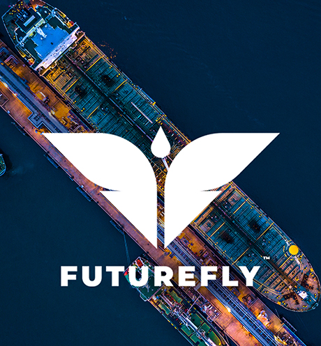
Turning tomorrow’s opportunities into today’s possibilities. In the realm of commodity trading, especially in the future trades of crude oil, it’s the little things that matter. Despite deviations per barrel being as small as a few cents, when multiplied over millions of barrels, the exposure becomes a significant concern. Go Back TURNINGTOMORROW’SOPPORTUNITIESINTO TODAY’SPOSSIBILITIES In the realm of commodity trading, especially in the future trades of crude oil, it’s the little things that matter. Despite deviations per barrel being as small as a few cents, when multiplied over millions of barrels, the exposure becomes a significant concern. Existing tools, though allowing traders to take action, faced limitations, mainly confined to outright front-month futures due to platform inadequacies. The absence of solutions for visualising future spreads and intricate doublefly structures prompted the need for innovation. The client aimed to revolutionise the market with a research and analysis tool, enabling the backtesting and forward testing of simulated doublefly structures. AHA was tasked with building the imagery of the product, starting with christening it with a fitting name, crafting the brand identity, designing and developing a demand generation website, and finally generating inquiries through an effective communication strategy. INJECTING AHA IN THE IDEAS This was an extremely niche category. Therefore, an identity that instantly connotes what the platform was about was imperative. Since this is about future commodity trading and doublefly, we brought the two together to arrive at an identity that is intuitive and automatically gets through to the target audience. The inspiration for the distinctive name “Futurefly” was drawn from the platform’s exceptional capability to anticipate future market movements. The concept embodied the essence of taking flight, symbolising a forward-looking and innovative approach to trading. The concept of ‘doublefly’ played a pivotal role in shaping the name, reflecting a strategic and dynamic outlook on market trends. The fusion of these ideas contributed to the creation of a name that not only conveys the platform’s predictive abilities but also captures the spirit of advancement and growth inherent in the world of trading. TAKING THE IDEA TO THE CONSUMERS IDENTITY: The identity was designed to be simple, minimalistic, and easily recognisable. It featured a combination of two letters, F, forming wings, with a pointed arrow at the bottom and a drop signifying oil at the top representing the head. The logo was crafted to resemble a butterfly, symbolising predictability, as the transformation from a cocoon to a butterfly follows a predictable journey. This choice of imagery aimed to convey a sense of transformation and reliability in the brand’s identity. This design aimed to achieve a fresh, youthful brand image with a futuristic touch. The choice of a sans-serif typeface added a bold vibe, complementing the overall brand and logo aesthetic. Website: A dedicated landing page was developed specifically for this. This webpage was carefully designed to meet the distinct requirements and preferences of businesses. The design and content were customised to deliver thorough information and effectively connect with potential B2B clients. The goal was to engage commodity trading decision-makers through a straightforward, intuitive design and messaging, that immediately conveyed the intended idea. Communications: The brand’s communication strategy was extended through social media channels, marking a significant step forward. The approach adopted for social media involved creating concise and impactful creatives that delivered messages directly and efficiently. Explore more kid super store hapikey howling wolf Ready to add wings to your brand? Get in touch

Child in blue denim outfit stands in a yellow spotlight with a paper dog, clouds, and raindrops; KidSuperStore.in logo below.
Uncategorized

Kid Super Store

Transforming kids’ fashion with design -tech. With over two decades of experience in the fashion industry, this Mumbai-based startup recognised significant issues in how kids’ fashion has been handled for years. Go Back TRANSFORMINGKIDS’ FASHIONWITH DESIGN-TECH With over two decades of experience in the fashion industry, this Mumbai-based startup recognised significant issues in how kids’ fashion has been handled for years. Their aim was to transform the industry by addressing these gaps, focusing especially on tier-two cities, which have always received minimal attention from fashion brands. AHA was mandated to bring the idea to life from Identity to developing the omnichannel platform. INJECTING AHA IN THE IDEAS While the startup’s intent and vision were clear, we had to uncover the unknowns that could potentially undermine a good idea unless addressed with an equally sharp approach in both idea and execution. This involved understanding consumer behaviour, market dynamics, as well as behavioural and situational barriers. Discovery 1: Kids’ fashion was not just fashion; it operated as a commodity business. If a tee was sold, more tees would follow, but the focus was often on individual items rather than coordinating outfits. The challenge lay in finding matching tops and bottoms – a fantastic pair of shorts might lack a suitable top, and vice versa. This mismatch often led to settling for second-best choices, turning kids’ fashion into a constant compromise. In addition, the lack of proper segregation in kids’ outfits restricted their freedom of choice. There was very little focus on fashion based on seasonality and trends especially when it came to kids’ fashion brands. Discovery 2: Retail offline and online channels often operated independently, creating a disconnect for consumers. What was easily found in one world might be elusive in the other. Discovery 3: Departing from the conventional model where brands usually handle product design independently, there was a conspicuous lack of community involvement and representation. Based on these discoveries, we inched a step closer to a solution to address the shortcomings of conventional kids’ fashion through a platform that, Curated a unique approach prioritising outfit pairing over individual product sales in kids’ fashion. Eliminated compromises associated with children’s fashion choices. Introduced proper segregation of kids’ outfits based on various factors for a more meaningful connection. Bridged the gap between offline and online channels with an omnichannel platform. Seamlessly integrated both worlds for a cohesive and unified shopping journey. Efficiently connected consumers to the nearest store in their catchment area. Provided an up-to-date inventory list for a personalised shopping experience. Introduced a collaborative design approach, empowering independent designers to showcase and monetise their products. From these findings and gaps, emerged the idea of an “omnichannel” platform that would offer consumers, A super-lative experience and a unique way to engage with the brand. Became synonymous with superior products and fashion ensembles. Catered to the preferences of both offline shoppers and those who preferred the convenience of online browsing. Supercharged the economy by uniting independent and budding designers with sellers. We named it “KID SUPER STORE”. TAKING THE IDEA TO THE CONSUMERS TECHNOLOGY: VISUAL: Our approach was a vibrant celebration of youthful energy and individuality. Stylish kids took centre stage against backdrops of bright hues. With intentional touches, we added an international look and feel, drawing influence from pop colours.The visual language was inspired by the world of superheroes and superstars the kids dearly look up to and gave them a chance to become their super selves by engaging/ interacting with the brand. IDENTITY: The brand identity was a vibrant showcase of fun and style. Picture trendy, playful kids stealing the spotlight against a backdrop of lively, bright colours. The fonts, a playful mix of straight and curved add a touch of modern flair.It was a brand that spoke the language of youth, celebrating individuality and fashion in every curve and colour. Explore more hapikey howling wolf emami gold Want to make your brand super? Get in touch

Emami Smart and Handsome Instant Radiance and Anti-Pimple Foaming Facewash tubes splashing in water.
Uncategorized

EMAMI SMART AND HANDSOME & FAIR AND HANDSOME

Making a smart move in the men’s grooming world. In the dynamic landscape of men’s grooming products, Fair and Handsome/Smart and Handsome embarked on a strategic journey to establish itself as a leader in the skincare industry. Go Back MAKING ASMART MOVEIN THE MEN’SGROOMINGWORLD In the dynamic landscape of men’s grooming products, Fair and Handsome/Smart and Handsome embarked on a strategic journey to establish itself as a leader in the skincare industry. Setting its sights on Myanmar, the brand wanted to fortress its position, aiming to become the go-to choice for men seeking effective and innovative grooming solutions. Simultaneously, it embraced the challenge of expanding its footprint in Malaysia, recognising the untapped potential within the market. With a forward-thinking approach, the brand sought to increase TTB opportunities in Singapore, fostering a strong presence and creating avenues for growth. Through a combination of quality products and a targeted market approach, Fair and Handsome/Smart and Handsome aimed to leave an indelible mark on the regional men’s grooming landscape, solidifying its reputation as a trusted and preferred brand. Our responsibility initially involved managing the communications for Myanmar, Singapore, and Malaysia. INJECTING AHA IN THE IDEAS The research shed light on human behaviour, societal norms, and cultural trends, specifically focusing on beauty in Korea, Japan, and China. It uncovered the various factors influencing perceptions and practices all around the world. The discoveries shed light on the evolving paradigms within the beauty industry, unveiling the dynamic interplay between innovation, language, trends, feminine influence, and the imperative of appearance in the professional sphere. Discovery 1: Influence of innovation of Korea + Japan + China:Our research illuminated the distinct impact of each country’s technological advancements, emphasising how these innovations have not only shaped but also redefined prevailing beauty ideals in their respective societies. This underscores the dynamic interplay between technology and cultural perceptions of beauty, providing valuable insights into the ever-evolving nature of societal norms across these East Asian nations. Discovery 2: Non-constrictive & non-conforming language of beauty:We noticed a notable shift in beauty discourse. There is an emergence of language that is non-constrictive and non-conforming, challenging conventional norms. This shift contributes to a more inclusive and expansive understanding of beauty, suggesting a broader acceptance of diverse perspectives and rejecting rigid, traditional standards. The discovery points to a cultural evolution in which language plays a crucial role in reshaping perceptions and fostering a more inclusive beauty narrative that embraces diversity and individuality. Discovery 3: Beauty trends promoted by influencers and brands:We found a symbiotic relationship between influencers and beauty brands in the digital realm. It highlighted that influencers play a pivotal role in setting and swiftly disseminating beauty trends, showcasing the dynamic impact of digital platforms on shaping the contemporary beauty landscape. Discovery 4: Feminine influence that triggered grooming habit:We uncovered the significant influence of femininity on grooming habits, shedding light on the psychological and sociocultural factors that shape these practices. It provides valuable insights into the intricate relationship between feminine influences and grooming routines, emphasising a deeper understanding of the motivations behind such behaviours. Discovery 5: Appearance competition to defend job-market equity:We came across the phenomenon of appearance competition in professional settings, revealing how individuals manage the delicate balance between personal presentation and the pursuit of equity in the job market. It uncovered the complex dynamics at play in contemporary workplaces, providing insights into the nuanced ways appearance factors into professional success and interpersonal dynamics. In conclusion, the strategy sought to enhance and ignite the growing interest in self-grooming by developing relatable and compelling content focused on lookism. The goal was to connect with our audience, encouraging them to adopt grooming practices that reflect their unique styles. The overarching aim was to instil confidence and promote self-expression among the audience. Following the successful delivery of our services, marked by high engagement rates on these platforms, we were entrusted with the additional mandate of overseeing the social media pages for the Middle East and Pakistan. This expansion reflected the confidence in our capabilities and the positive impact we had on the digital presence of the brand. TAKING THE IDEA TO THE CONSUMERS Visual language: In visual communication, we centred our approach on the theme of lookism, showcasing achievers and strivers. We incorporated brand symbols that connect with our audience, and the bold messaging conveyed a narrative beyond aesthetics, emphasising self-expression and success. The goal was to establish a visual language that mirrors current trends and solidifies our brand identity in the audience’s minds. Packaging: As a newcomer in these markets, Emami focused primarily on native citizens and served a relatively small South Asian population. Given the limited market size, it became essential to adopt a more appealing strategy to expand the market presence and stand out on the shelf. Following specific category codes were necessary. In aiming to capture the lion’s share of the market, Emami recognised the need for a larger and more robust visual identity. Our goal was to elevate the packaging’s appeal and shelf impact, differentiate it from competitors, enhance benefit callouts, and reinforce brand equity. Recognising that consumers in our target group were primarily influenced by promises of function and category familiarity, our approach sought an intersection of art and science. We aimed for a packaging design that avoided dissonance, ensuring a powerful shelf statement for Fair and Handsome Facewash. Explore more plateonic mandala xndm Looking to outsmart your competition? Get in touch

Person holding a plate of fresh fruits with "Thank God it's Friday!" and #HealthyStart on a blue background, Inito logo above.
Uncategorized

inito

Helping couples take control of family planning. Given a clear mandate, our task was to breathe life into the concept and, more importantly, establish credibility and assurance effectively. Couples may encounter challenges when trying to conceive, leading to stress and prompting them to explore alternative methods such as IVF, surrogacy, or adoption. Go Back HELPING COUPLESTAKE CONTROL OFFAMILY PLANNING Given a clear mandate, our task was to breathe life into the concept and, more importantly, establish credibility and assurance effectively. Couples may encounter challenges when trying to conceive, leading to stress and prompting them to explore alternative methods such as IVF, surrogacy, or adoption. In a landscape where fertility often relies on medical professionals and labs, Inito sought to simplify the process and allow couples to take control of their destiny with a scientifically backed, user-friendly tool that empowered couples to plan their conception more effectively and tackle the challenges of soaring medical expenses. Inito Fertility Tracker was meant for couples to understand their ovulation cycles better and use the information to plan their pregnancy. Many couples face challenges in conceiving because of inadequate planning, often attempting to conceive after the optimal fertility window has passed. Inito addressed this gap with its innovative device incorporating hormone analysis to help couples increase their chances of getting pregnant by 89% with 99% clinical accuracy. The whole intent of Inito was to “simplify” the process. It involved utilising an environment accessible to everyone, regardless of educational or societal background. It only required a platform and technology that is easy to understand and use, as simple as ABC. Allow the test strip to soak in urine(first urine of the day) for 15 sec Insert the test strip into the InitoFertility Monitor See results on the Initio Appand plan INJECTING AHA IN THE IDEAS In a landscape where medical professionals and labs play a significant role, our primary objective was to tackle a critical challenge: instilling assurance and credibility. We sought to empower consumers (couples) to take charge of their future. The question was: “How can a digital device empower couples for a confident and controlled fertility journey?” Moreover, it was crucial to note how couples spent a considerable amount of time searching for information and reading reviews, FAQs, and articles during times of stress. They sought help and reassurance, turning to people and platforms that could provide comfort and confidence. In the quest for parenthood, the expense of fertility treatments compounds the stress of not conceiving naturally. At that point, what matters is unwavering assurance – something that encourages couples to stay hopeful and persist in turning their dreams into reality. We took the human insight that “support outweighs setbacks” and mapped the brand idea with this journey. “HOPE AND ASSURANCE: REALITY’S TRUE LENS”. TAKING THE IDEA TO THE CONSUMERS Identity: Taking inspiration from the camera lens – the core idea of Inito was to symbolise the profound role it embodies in the Inito Fertility Monitor experience. This intentional choice served as a visual motif and encapsulated the essence of how perspective and clarity are fundamental to the Inito journey. The lens, a potent symbol of focus and insight, becomes the gateway through which individuals perceive and navigate their unique fertility narratives with confidence and empowerment. THE LENS The Lens symbol in the logo has been designed using Fibonacci numbers to bring symmetry, balance and beauty through the usage of the Golden Ratio. The ratio between, both, the thicknesses and radii of the three circles has been designed to maintain a ratio of 1.618. Visual language: The visual language comprised three key elements: the camera lens, capturing life’s bright side; vibrant colours, infusing positivity and semiotics; conveying symbolic values of hope, joy, optimism, and assurance. The lens concept was a visual tool and a narrative hook, inviting individuals to perceive the fertility journey through a positive and focused perspective. We used vibrant and inviting visuals coupled with strategic colour psychology. Our aim was to instil confidence and positivity, guiding couples on a path where the journey to conception became a source of joy and happiness. Website: The website extended the same visual language, prioritising function over form as its core intent. This approach aimed to ensure that users could effortlessly access pertinent information, fostering confidence in their interactions with the platform. The aim was to provide a user-friendly space where visitors can seamlessly access valuable information and feel assured about their journey with Inito. Blogs: The blog section focussed on articles and studies that reinforced the “assurance” and “credibility” KPIs. To ensure the correct information was disseminated, the articles were meticulously crafted following in-depth research and validation by doctors, medical practitioners, nutritionists, and more. The articles were tailored to address user queries and directed them to specific pages on the Inito website providing accurate and reliable answers. Film: The film focussed on the common emotional struggles of couples dealing with infertility. It followed a woman’s challenging journey to conceive, exploring the emotional ups and downs, physical strain, and mental toll during months of unsuccessful attempts. The turning point in the story, marked by the discovery of Inito, represents a potential solution that injects hope into the narrative, offering a fresh perspective on fertility tracking and family planning. Ultimately, the film sought to shed light on the everyday struggles faced by many couples and aimed to resonate with the audience’s emotions, especially those who might have been navigating similar challenges on their path to conception. Explore more savia emami shfh plateonic Looking to multiply your brand’s buzz? Get in touch

Scroll to Top